
Interiors · Dubai
Reading time: 5 minA café’s signature colour is its identity, which is why changing it is such a risk. For the Jumeirah branch of Brew, H2R Design took that risk, swapping the brand’s familiar green for a coastal blue because the café sits by the sea. It is a bold move, and a clever one, because the blue was hiding in Brew’s own history all along.
Most café refreshes tidy up the furniture and repaint a wall. H2R Design did something braver with the Jumeirah branch of Brew Café. It changed the brand’s colour. The studio would bring that same conviction to Brew’s second Dubai branch in Mirdif soon after.
For years, Brew has been known by its signature green, the shade that says “this is a Brew” before you have read the sign. For the Jumeirah refresh, H2R traded that green for a calm, coastal blue, a decision that sounds small and is in fact enormous. A brand’s colour is a promise its regulars recognise without thinking, and altering it risks breaking the very connection that makes people loyal. That H2R did it anyway, and made it feel not like a rupture but like a natural step, is what makes this small project genuinely interesting. It is a case study in one of the hardest things in design: how to change a beloved thing without losing what made it beloved.

Evolving a brand without losing its soul
The studio behind it, H2R, is the London and Dubai practice of brothers Hasan and Husain Roomi, and this is one of several Brew cafés they have shaped. Hasan Roomi frames the Jumeirah project not as a renovation but as an evolution, and the distinction is the whole point.
“Design should evolve without losing the soul of a brand,” he says of the scheme, which the studio named “Brew Me Up.” The idea behind that name is a collage: rather than one clean visual statement, H2R assembled the café from layered shapes, volumes and materials that add up to a cohesive whole, so a regular can still feel Brew’s familiar personality while discovering something new in it. This is the trick of a good refresh. The soul stays put, and everything around it grows up. For a café with a devoted following, keeping that emotional thread intact while reinventing the look is a far harder brief than starting from a blank room, and H2R clearly relished it.


Why blue, and why it works
The colour change is bold, but it is not arbitrary, and the reasoning is what makes it land.
The first justification is place. Brew’s Jumeirah café sits moments from the shoreline, and blue is the sea’s own colour, long tied to calm, clarity and water. Wrapping the café in blue forges an immediate link to the beach outside the door, so the interior belongs to its setting rather than ignoring it. That alone would be a sound decision.
The second justification is the clever one. The blue is not a colour imposed on Brew from outside. It is a return to Brew’s own past, since blue appeared in the brand’s early identity work before green took over. So H2R has not really changed Brew’s colour at all. It has surfaced one that was always there, and let the seaside give it a reason to come back. The move reads as both new and deeply rooted, which is exactly the balance the whole project is chasing.
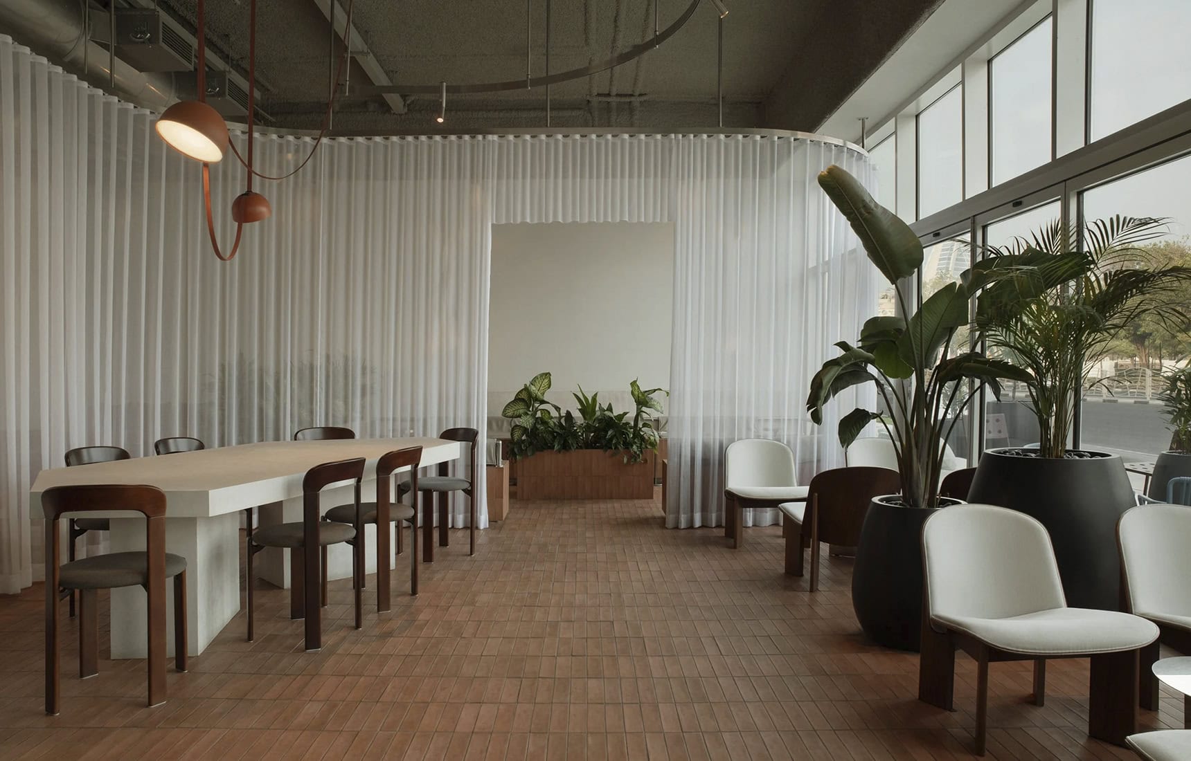
And crucially, the blue is warmed. To stop the coastal palette turning cold, H2R grounded it with terracotta and earthy tones through the flooring and the built-in seating, textures that evoke sand, clay and driftwood. The blue gives the café its serenity, the terracotta gives it its warmth, and the two together keep the room from ever feeling like a cool, hard minimalist box.


The counter that keeps Brew, Brew
If the colour is what changes, the counter is what stays, and it is doing important work.
At the heart of the café sits a tiled counter, a design element carried over from Brew’s other branches, so that however much the palette shifts from place to place, this one recognisable object keeps every Brew unmistakably a Brew. The tiled island flows organically into a built-in terracotta-toned bench, creating a grounded, cosy zone that invites both sociable gatherings and quiet solo moments. This is the mechanism of the whole refresh made physical. The tiled counter is the constant, the thread of continuity that lets everything else, the colour, the textures, the site-specific mood, change freely without the brand ever losing its footing. It is how you evolve without losing the soul, expressed as a piece of furniture.

A layered, tactile room
Around the counter, H2R builds its familiar language of warm contrasts.
The interior is deliberately layered and tactile. Rough plaster walls meet smooth timber panelling, a pairing of raw and refined that gives the room warmth without fuss. Brushed metal accents catch the light and add a quiet contemporary edge, while soft textiles and curtains act as flexible dividers, carving out moments of intimacy without ever blocking the openness or the natural light. Lighting is handled with care, with sculptural ceiling elements and feature pendants guiding you through the space and picking out the material contrasts as you go.
None of this is showy, and that is the H2R signature. The studio works in texture and restraint rather than statement gestures, trusting materials and light to do the talking. It also had to solve real problems along the way, since this was a refresh of an existing structure with its own layout constraints, and every decision had to be precise to make the room feel open and connected within those limits.


Frequently asked questions
What is Brew Café Jumeirah? A beachside branch of the Dubai coffee brand Brew, given an interior refresh by H2R Design under the concept “Brew Me Up.” It sits close to the Jumeirah shoreline.
Who designed it? H2R Design, the London and Dubai studio founded by brothers Hasan and Husain Roomi, known for warm, material-led hospitality interiors.
What is the biggest design change? The shift from Brew’s signature green to a coastal blue palette, chosen to link the café to the nearby sea, and a subtle return to blue tones from Brew’s original brand identity.
How is it kept recognisably “Brew”? Through a tiled counter carried across Brew’s branches, which acts as a constant visual anchor and keeps the brand consistent even as the palette changes by location.
What materials define it? Rough plaster and smooth timber, brushed metal, terracotta flooring and built-in seating, and soft textile dividers, all in a blue-and-earth coastal palette.

Final thoughts
The Jumeirah refresh of Brew Café is a small project with a big lesson inside it. Changing the signature colour of a brand people love is the kind of decision that can go badly wrong, and H2R made it go right by grounding the boldness in reasons: the sea outside, the blue in Brew’s own past, the tiled counter holding everything steady.
What you end up with is a café that feels new and completely itself at the same time, coastal and calm, warmed by terracotta, unmistakably still a Brew. It is a quietly confident piece of work, and a reminder that the best refreshes are not about erasing what came before but about helping a brand become a fuller version of itself. H2R changed Brew’s colour and, in doing so, kept its soul entirely intact.

Leave a Reply