
INTERIORS · LONDON
Reading time: 10 minIn the summer of 2019, Guinevere on the King’s Road handed three of its windows to three designers from three continents and asked for colour. It produced the most concentrated design brief there is: one wall, no door, no dwell time, and a sheet of glass in the way. The shop that set it had been founded by a hat designer, which explains a great deal.
A shop window is the most constrained room a designer is ever asked to make.
It has one wall. Nobody enters it. Nobody sits down in it, touches anything in it or spends more than a few seconds looking at it. It is seen through glass, usually at an angle, usually while the viewer is walking, and for half the year it is seen in the dark. Every instrument an interior designer normally works with is taken away: circulation, comfort, acoustics, materials under the hand, the slow reveal of a plan.
What is left is composition and colour. Which is why it is a good test, and why the three windows Guinevere gave away in the summer of 2019 are worth going back to.
The shop, at 574 to 580 King’s Road in Chelsea, invited three designers to take a window each and dress it from stock: Geoffroy Van Hulle from Belgium, Sig Bergamin from Brazil and Phillip Thomas from New York. The result was called Three Kings of Colour, it ran from 6 June to 19 July 2019 as part of Chelsea Design Quarter’s summer programme, and each of the three solved the same wall in a completely different way.
There is also a reason Guinevere in particular was the right shop to set that brief, and it goes back to 1963.

A milliner opened it
Genevieve Weaver came to London from Normandy in the early 1950s and worked as a hat designer. In 1963 she opened Guinevere on the King’s Road, and over time it grew across four adjoining shopfronts at the western end of the street.
That first career is not a footnote. Millinery is the trade of making an object that has to read instantly, from the front, at a distance, on a moving person. No second glance, no explanation, no context. Which is, almost exactly, the brief of a shop window.
Her buying rule was as compressed as her first trade: if you see something you absolutely love, then you should buy it.
Read that as a business policy and it is remarkable, because it contains no period, no category and no country. It is why the shop could hold pieces spanning the 1500s to the 1960s, sourced from Britain, India, China, Pakistan, Thailand and Singapore, and still feel like one place rather than a warehouse. The stock was never organised by history. It was organised by eye.
After Genevieve’s death in 2000 the business was run by her sons Marc and Kevin Weaver, with Marc’s wife Heather, and that eye was the thing they inherited.
An inventory assembled on that principle is the ideal raw material for a window, because nothing in it belongs to a scheme yet. Every object is available to be argued with.
Why one wall is harder than four
Before the three designers, it is worth setting out what the format actually demands, because it is more technical than it looks.
There is glass in front of it. A window is always seen through a reflective plane, so half of what a passer-by sees is the street behind them. Strong, saturated colour is the most reliable way to win that fight, because a pale scheme simply loses to a reflection of a bus.
It is approached at an angle. Almost nobody stops square on. They arrive obliquely at walking pace, which means the composition has to hold from about forty-five degrees and has to survive being read in the wrong order.
There is no scale reference. In a room, a door and a ceiling tell you how big everything is. A window gives you nothing, so scale has to be established inside the frame, usually by putting one deliberately large object next to one deliberately small one.
It works hardest after dark. For much of the year the window is the brightest thing on the pavement, and lighting is the difference between a display and a lit box. This is where Van Hulle’s stated method is exactly right for the format.
And it has to be understood in three seconds. That is the real constraint, and it is why colour does the work. Colour is the fastest information a surface can transmit. Detail comes second, and provenance, which is what an antiques shop normally sells on, comes a distant third.
So a colour brief in an antiques window is not a decorative whim. It is the correct response to the medium.

Geoffroy Van Hulle built a room
Van Hulle’s window is the one that behaves most like an interior, and his background explains why.
He is the sixth generation of a family of decorators and furniture makers in Maldegem in Belgium. The family began by making dining furniture for local households; after the First World War, in 1918, his great-grandmother opened a shop beside the workshop, and his grandmother and mother turned it into a classical interiors business. He now works across Belgium, the Netherlands, Luxembourg, Britain, France and the United States, and cites Leonardo da Vinci, Tony Duquette and his mother as his reference points.
On lighting, his own phrase is the useful one: he plays with chiaroscuro, working the contrast between what is lit and what is left in shadow. In a window seen mostly at night, that is not a stylistic preference, it is the operative skill.
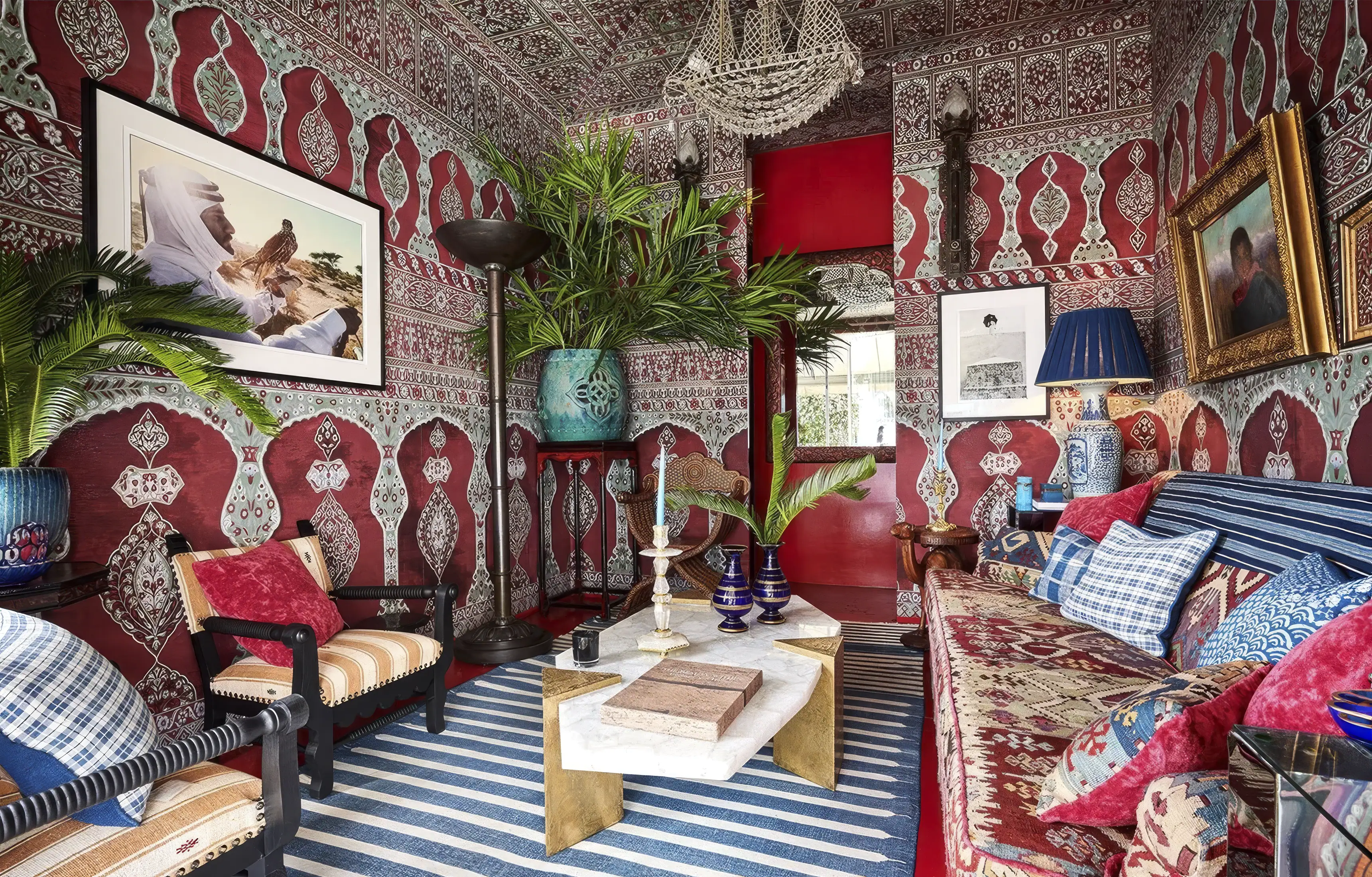
His window began with a wall. Rich red hand-painted wallpaper gave the display a ground rather than a backdrop, and everything else was set against it: a striped blue and white rug, a rock crystal coffee table and a Chinese blue and white porcelain lamp, with a Moroccan register running through it.
The colour logic is precise. Red and blue sit far apart, so a blue and white rug on a red ground separates instantly at distance, which is exactly what a moving viewer needs. And the rock crystal is the clever piece. In a saturated scheme the one transparent object is the one that gives the eye somewhere to rest, and it also lets light through the middle of the composition rather than bouncing it back at the glass.
Van Hulle has said he uses colour to bring absolute joy into a space. In a window, joy is also the most efficient thing you can transmit in three seconds.

Sig Bergamin wrote the book on it
If the brief was colour, Bergamin arrived with the strongest possible credentials, because he had literally published on the subject the year before.
He trained as an architect at the Santos School of Architecture and Urbanism, works from São Paulo with offices in New York and Paris, and has more than thirty-five years of practice behind him. His book Maximalism was published by Assouline in 2018, and he describes himself in exactly that term.
Maximalism is widely misread as an absence of discipline, and it is the opposite. A room with a hundred things in it only works if something is repeating. Take the repetition away and it is clutter; put it back and the eye reads a system. The discipline is in choosing what recurs.
His window layered colourful fabrics by D’Ascoli through the composition, with an Italian giltwood mirror and, the detail worth stopping on, glass shell dishes displayed in French capital-topped shelves.
That last item is the most Bergamin thing in the whole exhibition. A capital is the top of a column, which is to say a fragment of a building repurposed as furniture, and setting small glass objects on it puts a delicate thing on top of a structural one. It is a scale joke and a material joke at once, and it solves the window’s missing-scale problem in a single object.
The mirror does something else useful. A window has a fixed depth, usually a shallow one, and a mirror is the only device that makes it read deeper than it is while also throwing the display’s own colour back at the street.
Phillip Thomas put a foot in the window
Thomas is the youngest of the three and his window is the most graphic.
He took a BFA in 2005, spent six years at Ingrao Inc. in New York, and founded Phillip Thomas Inc. in 2011. His stated method is unglamorous and correct: if you want to make your clients happy, listen to them talk about how they want to live.
His window ran Le Manach Plumette wallpaper against Taraz ikat stripes, and set an Italian plaster foot on a French Régence style bureau.
Pattern against pattern is the hardest thing in this list to bring off, and it works on one principle: the two patterns must differ in scale, not in colour. A feathered small-repeat paper behind a bold woven stripe reads as depth. Two patterns at the same scale read as noise. That is a rule any reader can take away and use on a single wall at home.
And then the foot. A plaster foot is an object with no function whatsoever. It is not furniture, it does not contain anything, it does not light anything. It exists purely to be looked at, which makes it the most honest possible thing to put in a shop window, and the most disarming. A passer-by who takes nothing else from the display will remember the foot.

What the colour brief was really for
Step back from the three windows and the exercise has a commercial logic that is worth naming, because it applies well beyond one shop.
The antiques trade traditionally sells on provenance and patina: what a thing is, where it came from, how old it is, how well it has aged. That is a collector’s language, and it works on somebody who already knows what they are looking at.
A colour-led window speaks to a different customer entirely, and it is the more valuable one: the decorator, and the person decorating. That buyer is not asking what period a lamp is. They are asking what it would sit next to.
Handing three windows to three working designers answers that question in the most direct way available. It does not show you an inventory. It shows you three finished opinions, made out of the same stock. A customer who cannot picture how a Chinese porcelain lamp, a rock crystal table and a striped rug belong together does not need a catalogue. They need to see it done once.
It is the same insight behind any good room set, and a window is a room set with the volume turned up, because it has to work in three seconds instead of three minutes.
The windows outlived the shop
This is the part that has changed since the display came down, and it changes how the piece should be read.
Guinevere closed its King’s Road shop permanently at Christmas 2024, after sixty-one years.
The family marked the sixtieth anniversary first, with a celebratory sale at Dreweatts at Donnington Priory in Newbury on 23 May 2023. The final dispersal followed at Sworders on 18 February 2025: nearly five hundred lots offered without reserve, including Flemish tapestry fragments, Anglo-Indian boxes from Vizagapatam and carved wooden roof ornaments from a Thai palace. Marc and Kevin Weaver’s own summing up was that it had been an incredible journey, and that the clients had become friends.
Read that list of final lots again, because it is the same buying rule from 1963 still operating sixty years later. Tapestry fragments, Indian boxes, Thai roof carvings. No period, no category, no country. If you see something you absolutely love, then you should buy it.
Which makes Three Kings of Colour worth more now than it was in 2019. It was a summer window scheme at the time. It is now a record of what a genuinely idiosyncratic shop looked like when three outsiders were let loose in it, six years before the doors closed for good.

Frequently asked questions
What was Three Kings of Colour?
A display at Guinevere on the King’s Road in which three international designers each took over a window and dressed it with pieces from the shop’s stock. It ran from 6 June to 19 July 2019.
Who were the three designers?
Geoffroy Van Hulle from Belgium, Sig Bergamin from Brazil and Phillip Thomas from New York.
What was Guinevere?
An antiques showroom at 574 to 580 King’s Road in Chelsea, founded in 1963 by Genevieve Weaver, spanning four adjoining shopfronts and stocking furniture, lighting, textiles and decorative arts from the 1500s to the 1960s.
Who founded Guinevere?
Genevieve Weaver, who came to London from Normandy in the early 1950s and worked as a hat designer before opening the shop. After her death in 2000 it was run by her sons Marc and Kevin Weaver with Marc’s wife Heather.
Is Guinevere still open?
No. The King’s Road shop closed permanently at Christmas 2024 after sixty-one years, with a final sale of nearly five hundred lots at Sworders on 18 February 2025.
What is maximalist interior design?
An approach that layers pattern, colour and objects from many periods and places. It depends on repetition rather than restraint: something in the scheme has to recur for the eye to read a system instead of clutter. Sig Bergamin published a book on it in 2018.
What was in Van Hulle’s window?
Hand-painted red wallpaper, a striped blue and white rug, a rock crystal coffee table and a Chinese blue and white porcelain lamp, in a Moroccan register.
What was in Bergamin’s window?
Layered fabrics by D’Ascoli, an Italian giltwood mirror and glass shell dishes set on French capital-topped shelves.
What was in Thomas’s window?
Le Manach Plumette wallpaper, Taraz ikat stripes and an Italian plaster foot on a French Régence style bureau.
How do you mix two patterns?
Change the scale rather than the colour. A small repeat behind a bold stripe reads as depth; two patterns at the same scale read as noise.

Final thoughts
The reason to keep this piece on the site is not the event. It is the brief.
One wall, seen through glass, at an angle, at walking pace, for three seconds. Strip an interior back to that and what survives is the part of the discipline that is hardest to teach: knowing what to put next to what, and in what colour. Three designers with entirely different training arrived at three entirely different answers, and every one of them is legible from across a road.
There is a neatness in the fact that the shop setting the test was opened by somebody who used to make hats. A hat and a shop window are the same design problem in different materials. Both are objects that have to be understood at a glance, from the front, by somebody who is moving.
Guinevere spent sixty-one years on the King’s Road being that kind of shop, and then closed. The windows are gone, the stock is dispersed, and the argument they made is still perfectly usable: put the strong colour at the back, the transparent thing in the middle, and one object in the front that has no purpose at all.

Leave a Reply