
INTERIORS · MELBOURNE
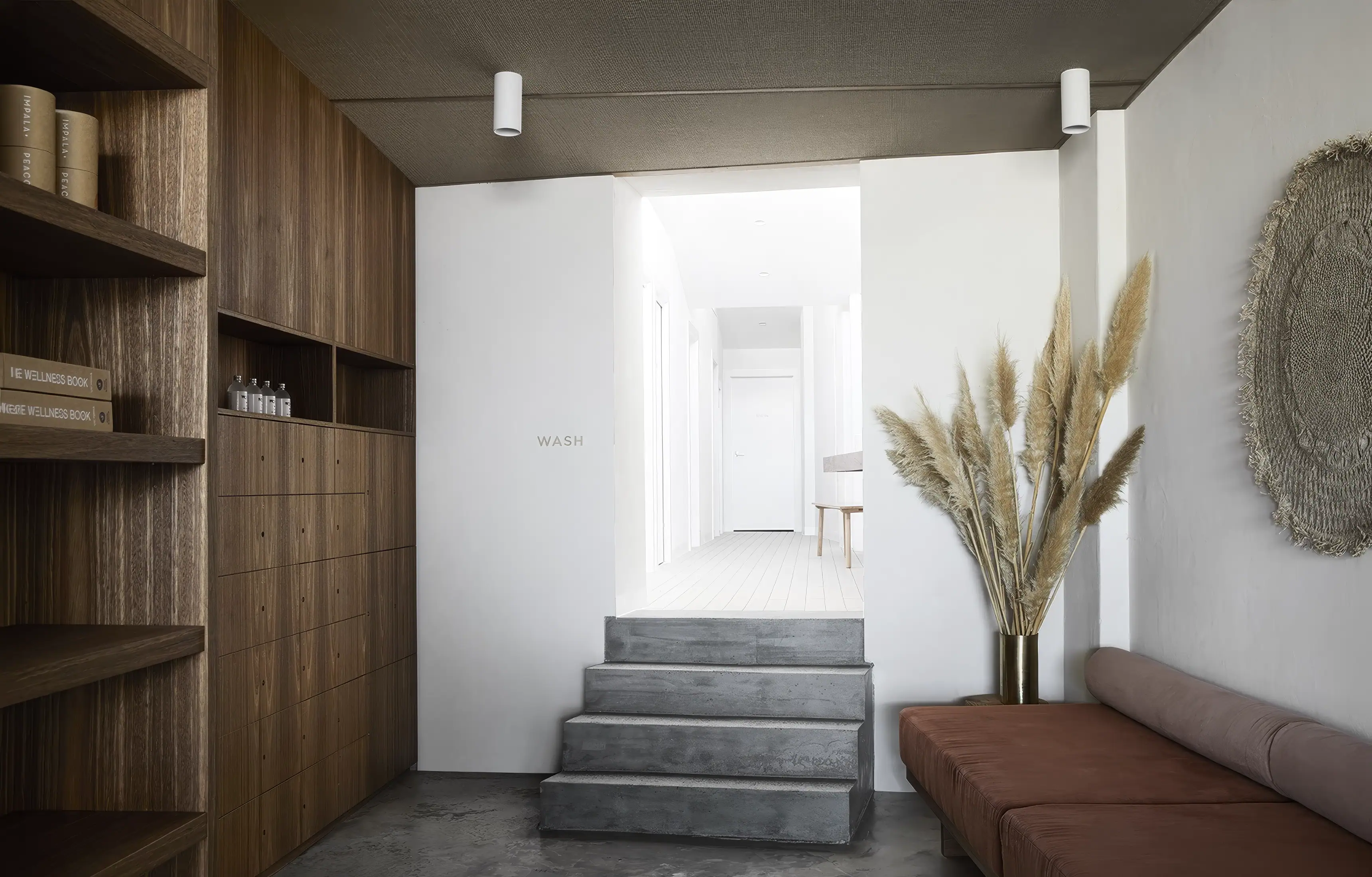
Reading time: 9 minAt Warrior One in Mordialloc, the Melbourne studio Golden stripped the carpet out, polished the concrete slab underneath, and lined the entrance ceiling in sisal instead. It sounds like a joke about inversion. It is two correct decisions taken at once, and it explains a room where texture does all the work that colour usually does.
Almost every interior is designed for people who are standing up or sitting down.
A yoga studio is not. For a good part of any class, and for all of the part people remember, the room is being looked at by somebody lying flat on their back with nothing else to do. The ceiling is a primary elevation in a yoga studio in a way it almost never is anywhere else, and the floor is being touched by bare skin rather than by shoes.
Golden, the Melbourne studio directed by Alicia McKimm and Kylie Dorotic, appear to have started from exactly there. At Warrior One, a 260 square metre studio in Mordialloc, a bayside suburb around 24 kilometres southeast of the Melbourne CBD, they took the existing carpet out, polished the concrete slab beneath it, and then lined the entrance ceiling in sisal.
The soft woven surface went up and the hard one stayed down. Put like that it sounds like a party trick. It is not. Both halves of it are the right answer to the specific question a yoga studio asks, and once you see why, the rest of the building falls into place.

The ceiling is doing the listening
Start overhead, because that is where the thinking is.
Sisal is a plant fibre, woven, open-structured and fibrous, and a woven fibre on a ceiling does something a painted plasterboard ceiling cannot: it absorbs sound from the one surface in the room that nobody touches, walks on or leans against.
That matters enormously here. A yoga studio is a room where a teacher needs to be heard clearly while speaking softly, over the sound of thirty people breathing, in a space with a hard floor and hard walls. Get the reverberation wrong and the instructor has to raise their voice, which changes the entire character of the class. Put the absorption on the ceiling and you can leave every other surface as hard and as durable as you like. It is the same reasoning that puts acoustic treatment overhead in a recording studio, arrived at from the opposite direction.

Then there is the second job, which is what it looks like. Sisal at close range is a visible weave, and the entrance is where you arrive, take your shoes off and slow down. A woven plane overhead reads as soft before you have touched anything.
In the two studios themselves the ceiling changes its argument. There the overhead surface is architectural hardwood beams, set in a steady rhythm. That is the correct move for a room where people will spend the last five minutes of the class flat on their backs looking straight up. A regular repeating rhythm is something you can breathe to. A blank ceiling gives the eye nothing and a busy one gives it too much. Counted beams give it a measure.

Polished concrete is the right floor for bare feet
The floor decision is the quieter one and it is just as considered.
The existing carpet came out and the concrete slab underneath was polished. That is a hard, level, cool, seamless, washable surface, and every one of those adjectives is doing work in a room where people practise barefoot.
Softness is not the floor’s job here, because the mat is the floor’s softness. A yielding floor under a mat introduces a second, unpredictable layer of give, which is the last thing you want in a standing balance. What the floor has to be is flat, stable and clean, and polished concrete is all three permanently, without a pile that holds moisture in a room where people sweat.
It is also cool underfoot, which is a genuine comfort in an Australian summer and a small piece of the sensory brief.
And there is a point worth making about how they got there. The best floor in the building was already in the building. Removing a covering and finishing what is beneath it is the cheapest, lowest-impact and frequently the best move available in a fit-out, and it is one of the harder things to persuade a client of, because it looks on paper like doing nothing.

Everything here is a textile decision, including the stone
Golden have described the approach as focusing on texture rather than colour, with materiality celebrated throughout. The room takes that further than the phrase suggests.
Look at the list. Sisal, a woven plant fibre, on the ceiling. Grass weave wallpaper on the faces of the bi-fold doors. Hand-textured render on the walls. Walnut timber veneer through the joinery, where veneer is chosen precisely because the grain reads as pattern. Pendant lights by the Melbourne studio Coco Flip, founded in 2010 by Kate Stokes and Haslett Grounds, made in white mesh fabric over a transparent backing. And fluted glass, which is not a textile but behaves like one, breaking an image into repeated vertical strands.
Every one of those is a weave, a grain or a nap. It is a completely coherent material argument, and it is the reason the room can be almost entirely muted and still be interesting to stand in.

Which brings us to the counter, and to the best fact in the project.
The custom limestone reception counter was carved by Steve Clark, who works as Den Holm from a studio in Reservoir in Melbourne. Clark started as a stonemason and bricklayer in Scotland at sixteen. He then studied design, majoring in textiles, and took a degree in embroidery from Manchester Metropolitan University. His studio is named after Denholm, the village on the Scottish Borders where he grew up, population around six hundred.
So the hardest, heaviest, most permanent object in a room built entirely on woven surfaces was made by a trained embroiderer. Nobody planned that. It is exactly the kind of coincidence that turns out not to be one, because a maker who thinks in thread thinks about surface, and the counter is the piece Kylie Dorotic has singled out as the physical manifestation of the whole idea.

Fluted glass is doing two jobs at once
The fluted glass sliding doors deserve their own note, because they solve a planning problem that is specific to this building type.
A yoga studio has to separate a class from the circulation around it without sealing it off. People arrive late. Instructors move between rooms. A class in progress needs to feel enclosed and calm while the reception area on the other side of the wall carries on. Solid walls make the studios feel like boxes. Clear glass makes them feel observed.
Fluted glass sits exactly between the two. The vertical ribs refract everything passing through into soft vertical bands, so light comes across fully while shape and detail dissolve. You get daylight deep into the plan, a sense of the building continuing beyond the room, and complete visual privacy for anybody in a forward fold.
It also, as noted above, matches the material argument. Rib the glass and it joins the weaves.
Between the two studios the same problem is solved differently again, with custom bi-fold doors in solid oak faced in grass weave, which fold back to make one large room out of two. The joinery inside each studio holds an instructor’s platform and hides the equipment, so that the room reads as empty when a class is not in it.

The bathroom is where the room raises its voice
Everything so far is muted. The bathrooms are not.
They are lined in pink Karaman marble from Turkey, with brass fixtures and solid walnut details, and the effect is deliberately unlike anything else in the building.
That is good sequencing rather than inconsistency. A bathroom is a short-dwell room entered alone, which makes it the safest place in any scheme to put the strongest material. Nobody spends an hour in it, so a saturated stone that would exhaust a studio becomes a pleasure for four minutes. And because it is the last room most people use before they leave, it does disproportionate work in what they remember.
The pink also closes a loop with the rust coloured loungers in the foyer. Two warm interruptions, at the beginning and the end of the visit, in a building that is otherwise sand, timber and fibre.

Golden had only just become Golden
There is a piece of context that makes the project read differently.
The practice was founded in 2013 as We Are Huntly, and rebranded as GOLDEN in 2017, a year before Warrior One was completed. Kylie Dorotic described the change as the result of a gradual redirection that had reinvigorated and refocused the studio, and Alicia McKimm has explained the name through the idea of being golden on the inside, which is a fair description of a practice whose work is nearly always about how a space feels from within rather than how it presents from outside.
Warrior One is one of the first projects to carry the new name, and it is a very clear statement of what that name was meant to mean. Alicia McKimm has put the brief simply: the ocean and the coast informed the materials and colour palettes and drove the sensory experience they were trying to create. The client’s own connection to the ocean and to surfing sits behind it, and this was their second studio, following one in Brighton.
Golden went on to design the adjoining café, completed later in 2018, which means the finished thing is a small wellness building rather than a single room.
The name of the business is worth a moment too. Warrior One is the English name for virabhadrasana I, a standing pose named after Virabhadra, a warrior figure from Hindu mythology. It is a pose about being planted and open at the same time, which is not a bad summary of a room with a concrete floor and a woven ceiling.

Frequently asked questions
Where is Warrior One?
In Mordialloc, a bayside suburb around 24 kilometres southeast of Melbourne’s CBD, in Victoria, Australia.
Who designed it?
Golden, the Melbourne interior design studio directed by Alicia McKimm and Kylie Dorotic. It was completed in 2018.
How big is it?
Around 260 square metres, containing a reception area, two yoga studios, guest amenities and bathrooms, with a café added later in 2018.
What is on the ceiling?
Sisal carpet, applied to the entrance ceiling. The two studios have architectural hardwood beams overhead instead.
Why put carpet on a ceiling?
It absorbs sound from a surface nobody touches, which lets the floor and walls stay hard and durable while keeping the reverberation low enough for a teacher to be heard speaking quietly.
What is the floor?
Polished concrete. The existing carpet was removed and the slab underneath was polished.
Why is polished concrete good for a yoga studio?
It is flat, stable, cool underfoot, seamless and washable, and the mat provides all the softness the practice needs.
What is fluted glass?
Glass with vertical ribs moulded into it, which transmits daylight fully while refracting shapes into soft vertical bands. It gives privacy without darkening a room.
Who made the reception counter?
Steve Clark of Den Holm, a Scottish-born stonemason based in Reservoir, Melbourne, who carved it in limestone.
What is in the bathrooms?
Pink Karaman marble from Turkey, with brass fixtures and solid walnut details.
Who took the photographs?
Sharyn Cairns.


Final thoughts
The reason this project is worth returning to eight years on is that its central decision is transferable and almost nobody makes it.
Treat the ceiling as a working surface. It is the largest uninterrupted plane in most rooms, it is the only one that nothing rubs against, and in any space where people look up or lie down it is the elevation with the highest attention and the lowest budget. Sound absorption belongs there. So does texture, because texture on a ceiling can be as delicate as you like and it will never be worn away.
The rest follows from taking the room’s actual use seriously. Bare feet want a hard floor. Quiet voices want a soft ceiling. A body in savasana wants a rhythm to look at. Somebody in a forward fold wants light without being seen. Not one of those is a style question, and answering them all is what produced the style.
There is also a lesson in the counter. A room made entirely of weaves was completed by a stonemason who trained in embroidery, and it is the single most photographed object in the building. Commission from makers rather than from catalogues and this is the sort of thing that happens.



Leave a Reply