
Interiors · Amsterdam
Reading time: 9 minThe palette of Amsterdam’s best bar comes from a series of photographs of people holding snacks. That is not a metaphor. Jacu Strauss took the colours of Super Lyan from a specific body of work by two American artists, laid them over plaster from three different centuries, and then roofed a courtyard to make the plan work. Seven years on, Europe’s 50 Best Bars has caught up.
In 2026, in the first ever Europe’s 50 Best Bars list, Super Lyan came in at number 42 and was named the best bar in the Netherlands. It is a good moment to look properly at the room, because the interior being celebrated is now seven years old and has never been substantially altered.
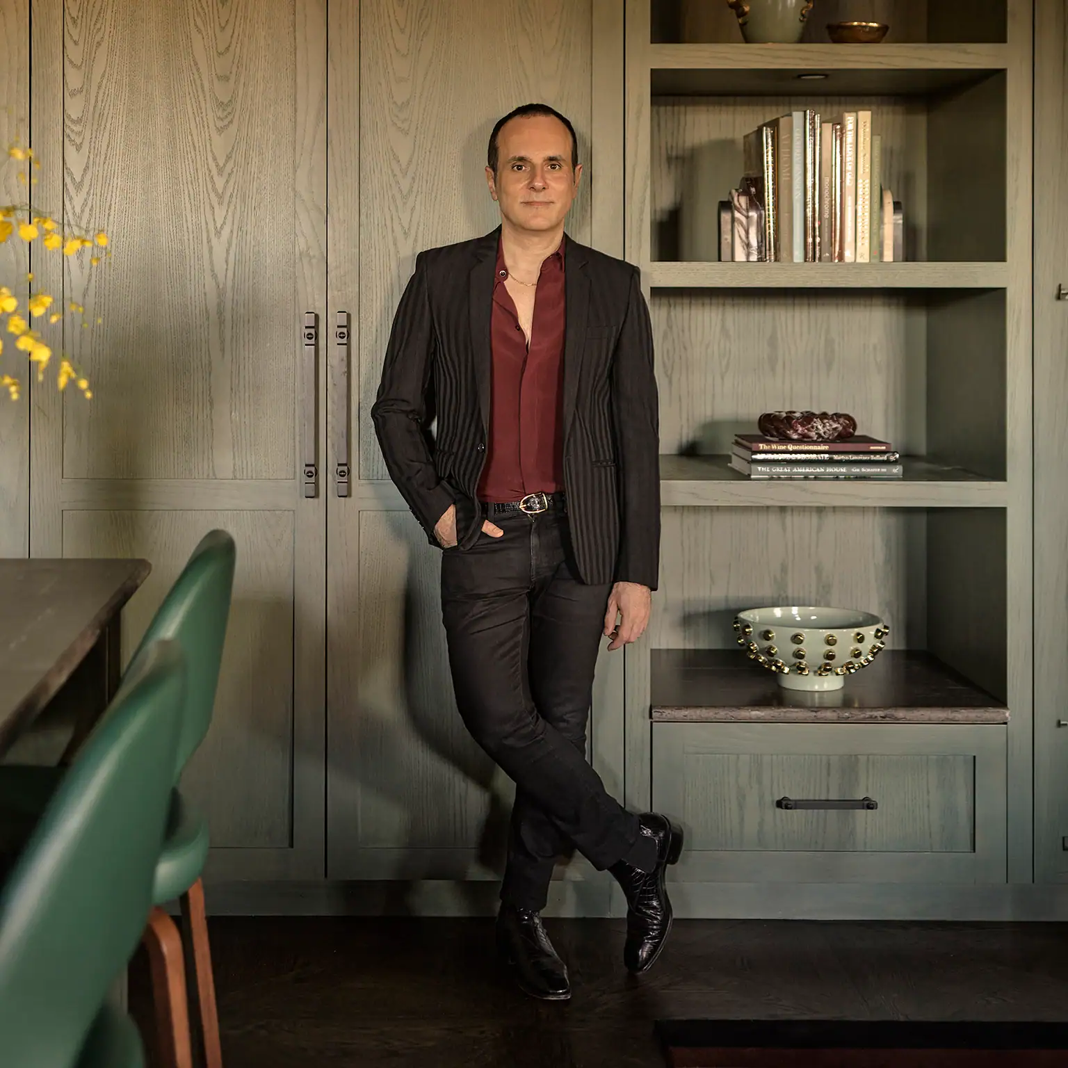
Super Lyan opened on 19 April 2019 on the ground floor of the Kimpton De Witt on Nieuwezijds Voorburgwal, and it is the Amsterdam bar of Ryan Chetiyawardana, the bartender who trades as Mr Lyan. The interior is by Jacu Strauss, working through Lore Studio for Lore Group, who operate the hotel.
Chetiyawardana gave the project its operating thesis before it opened, and it is the sentence the design has to answer. “In the end, it is not a hotel bar, it is a bar within a hotel.” Making that true is a spatial problem, not a branding one, and Strauss solved it with three moves: he roofed a courtyard, he borrowed a colour system from somewhere unexpected, and he refused to cover up the building he was working in.

He put a roof on the courtyard
Start with the plan, because everything else depends on it.
The ground floor Strauss inherited had a small, isolated lounge and an external courtyard, which in Amsterdam is usable for perhaps four months a year. He put a glass roof over the courtyard. That single intervention turned a leftover outdoor space into an interior room and gave the bar three distinct areas instead of one cramped one.
They are formally the Super Lyan Garden, the Bar and the Living Room, and the published capacities tell you how the weight is distributed: sixty five covers across the main bar and lounge, forty five in the covered courtyard. In its original operating model the garden ran from seven in the morning until midnight, serving coffee and plates, while the bar and living room were evening only. That is how you make a bar inside a hotel behave like a bar rather than a lobby appendage. The hotel guest who wants breakfast and the Amsterdammer who wants a Bay Cosmo at eleven at night are using the same address and, for practical purposes, different venues.
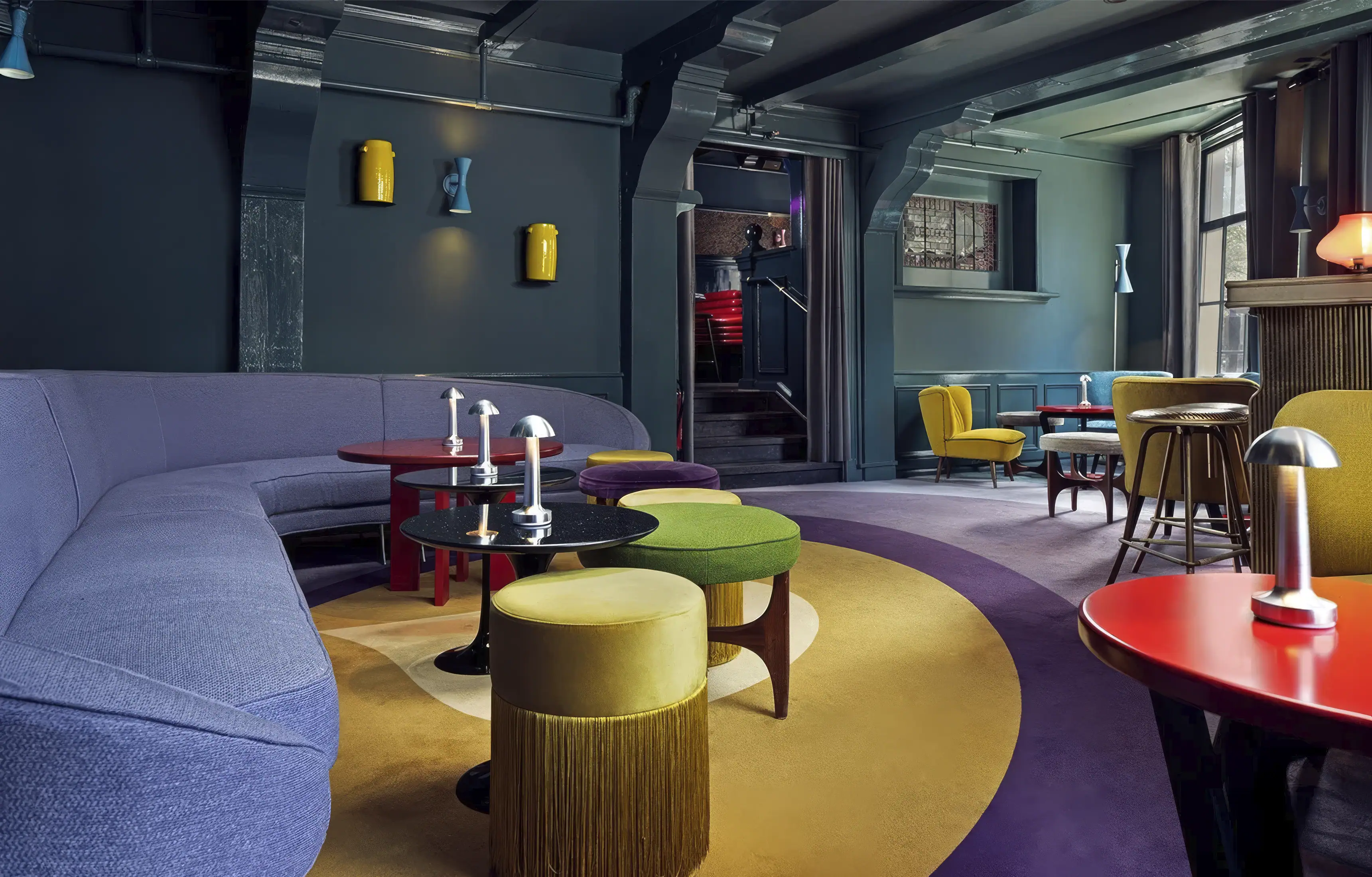
The three rooms then take deliberately different registers. The garden is bright, blue and white, hard-surfaced. The bar is dark, circular, wrapped in a matching neon ring you can see from the street. The living room is the softest of the three, a private-feeling space of psychedelic colour, retro furniture and a vintage minibar. You move from a conservatory to a diner to somebody’s front room in about twenty paces.

The colours come from a photographic series about eating
Here is the detail that makes this interior worth a proper article, and it deserves far more attention than it has had.
The colour scheme is drawn from Wardrobe Snacks, a photographic series by Kelsey McClellan, who shot it, and Michelle Maguire, who styled it. It circulated in 2017. Each image shows a sitter cropped to the torso, holding a single item of food, against a flat block of colour, with their clothing colour-matched to what they are eating. A green ice cream cone. A plain yellow doughnut. An oyster.
The artists have described where it came from: “Wardrobe Snacks was inspired by diners lacking the luxury of being seated at a table: Michelle’s stepdad who rests his sandwich on his thigh (hell with a plate!) in between bites while he blasts an action movie on his TV; a commuter cramped up on a crowded bus retrieving an item from a bag or pocket; a lunch-breaker on a park bench eating from her lap.”
As a source for a bar, this is a much better idea than it first sounds. A photographic series that already does the work of pairing a strong flat colour with a specific food gives a designer a ready-made palette that is coherent, saturated, slightly artificial and entirely about consumption. The reference is doing structural work, not decorative work. It is why the reds, purples and mustards in the seating read as a family rather than as a scattering of accent colours, and it is why nothing in the room looks like a mood board of the 1950s.
The timing matters too. Wardrobe Snacks appeared in 2017 and the bar opened in 2019. This was a current reference, picked up while it was still moving, not a period pull.

Old plaster left showing
The second decision is the one that keeps the whole thing from becoming a set.
Super Lyan sits inside a seventeenth century Dutch house, with interior fabric that has been added to repeatedly since. Rather than lining it out and starting again, Lore Studio chose to continue the layering: to build a contrasting design that stands alongside and reveals the older walls and panels, some nineteenth century, some from the 1920s. The original plaster is still there in 2026.
That is a genuinely difficult thing to pull off with a palette this loud. Bright colour and old plaster usually cancel each other out, one reading as decoration applied to the other. What makes it work here is that the new material is unambiguously new: patterned concrete bricks, terrazzo, gloss paint, lacquer and coloured mirror, all of them obviously manufactured, none of them pretending to be old. Nothing is distressed. Nothing is reclaimed for effect. The historic surfaces are left as themselves and the new ones are left as themselves, and the room is the conversation between them.
Strauss has described his own signature as a matter of “contrasting elements: old and new, rough and smooth”, and this is the clearest small example of it in his portfolio.

The bar counter is an ice cream sundae
The bar itself is the room’s set piece, and its logic is dessert.
The design team’s own description is of an ice cream sundae: a counter surface that reads as chocolate sprinkles scattered through a pale ground, a bar front detailed to look like the layers of a parfait, and cherry red button barstools at the foot of it. Strauss has said the counter puts him in mind of a spaceship from The Jetsons, which tells you the reference is doing double duty, midcentury and confectionery at the same time.
Materially it is a circular volume with a neon ring above it, and the surfaces around it are chosen to move light around: gloss paint, lacquered joinery, coloured mirror. In a room that fills up and gets darker as the evening runs, that reflectivity is the mechanism by which the space gets livelier rather than just busier. The garden room’s palm-era terrace materials, the patterned concrete bricks and terrazzo, are the studio’s own nod to what they call the golden age of Palm Springs in the middle of the last century.
The furniture is where the project turns out to be less precious than it looks. There are blue clay stools by Maarten Baas, which is a proper piece of Dutch design placed deliberately, and a Seletti Lipstick armchair upholstered in Toiletpaper fabric, which is about as loud a single object as you can buy. And then a good deal of the rest of the midcentury furniture was sourced from eBay. For a bar that could easily have been assembled from a specification schedule, that is a telling detail and an honest one.

Chetiyawardana designed the drinks the same way
The interior and the drinks programme were arrived at by the same method, which is rarer than it should be.
Chetiyawardana describes his approach as “using ideas from the past, and folding them into the space, taking things that are familiar and adding an exploded view.” That is precisely what Strauss did with a 1950s American diner: take the familiar form, blow the colour out of proportion, keep the geometry.
Super Lyan’s menus have always been organised by taste and mood rather than by spirit, and the Amsterdam programme was built for local drinking habits rather than imported wholesale. “Just like the French don’t really drink Cognac, genever’s not a big thing here,” Chetiyawardana observed, and, on the food question, “Unlike in the UK, in Europe people always eat alongside drinking, so you don’t want anything too sweet.” The current list, Boroughs of Amsterdam, is eight cocktails built on the city’s neighbourhoods.
The brand identity is by Magpie Studio in London, who built a comic-book character around a lightning bolt S and carried it through signage, menus, coasters and pin badges. Chetiyawardana’s line on that work is a good description of what a graphic designer is actually for: “Magpie managed to create the character that was actually at the core of what I wanted the brand to stand for; and they managed to personify this in a way that I couldn’t have described.”

Where Jacu Strauss comes from
Strauss grew up in the Kalahari, trained architecturally in New Zealand and then studied at the Bartlett and the University of Westminster in London. He graduated in 2008 and joined Tom Dixon’s Design Research Studio as a senior designer, where he completed Mondrian London at Sea Containers, his first hotel.
His account of the transition is direct: “It was there where I completed my first hotel and, eventually, I was offered an exclusive role as Creative Director of what is now called Lore Group.” On Dixon as a mentor, he says: “He made me understand the values of storytelling and how design can lift one’s mood.” You can see both halves of that in Super Lyan, which is a room built on a narrative source and unambiguously designed to make people feel better than they did outside.
Since then he has done the complete redesign of the Pulitzer Amsterdam, completed 2016, and gone on to Riggs Washington DC, Lyle Washington DC, One Hundred Shoreditch and the transformation of Hotel Park Ave in New York, as well as Lyaness at Sea Containers, which is Chetiyawardana’s London flagship. Super Lyan is the second of two Amsterdam projects, and the smaller of them by a wide margin, which makes its European placing this year all the more satisfying.

Frequently asked questions
Where is Super Lyan?
Nieuwezijds Voorburgwal 3, on the ground floor of the Kimpton De Witt hotel in central Amsterdam. It currently opens Wednesday to Sunday, from five in the afternoon until midnight.
Who designed the interior?
Jacu Strauss, working through Lore Studio for Lore Group, who operate the hotel. It opened on 19 April 2019.
Is Super Lyan still open?
Yes. In 2026 it was placed 42nd in the inaugural Europe’s 50 Best Bars list and named the best bar in the Netherlands.
Who is Mr Lyan?
Ryan Chetiyawardana, born in Manchester in 1984 and raised in Birmingham, who studied fine art at Central Saint Martins and biology and philosophy at Edinburgh before opening White Lyan in Hoxton in 2013. He was named world’s best bartender in 2015.
What are the three rooms?
The Super Lyan Garden, a covered courtyard seating forty five; the Bar, circular and neon-lit; and the Living Room, a softer lounge with retro furniture and a vintage minibar. The bar and lounge together seat sixty five.
Where does the colour scheme come from?
From Wardrobe Snacks, a 2017 photographic series by Kelsey McClellan and Michelle Maguire in which sitters’ clothes are colour-matched to the food they are holding.
Is the building historic?
Yes. The bar occupies a seventeenth century Dutch house within the hotel, with later nineteenth century and 1920s interior fabric deliberately left visible.
What is the connection to Tom Dixon?
Jacu Strauss worked as a senior designer at Tom Dixon’s Design Research Studio before joining Lore, where he completed Mondrian London at Sea Containers.

Final thoughts
Super Lyan does something cleverer than quoting a decade. It takes the structure of 1950s American design, the flat saturated colour and the simple geometry, and fills that structure with a palette lifted from a photographic series made in 2017 about people eating standing up.
The result is a room that is unmistakably retro in shape and not remotely nostalgic in feeling, sitting inside plaster that is four hundred years old and making no attempt to match it. Seven years after it opened, with nothing changed, it has just been called the best bar in the Netherlands. That is a decent argument for designing from a specific source rather than a general mood.
Leave a Reply