
INTERIORS · TELEVISION
Reading time: 9 minA sitcom apartment is a room built to be read from exactly one side, by a camera and a live audience sitting where the fourth wall should be. Everything follows from that. The Will & Grace set was drawn by a trained architect who interned with Robert Venturi and assisted Charles Moore, which turns out to be the most relevant education imaginable.
Ask an interior designer what a room has to do and the answer involves comfort, durability, storage, light and the way people move through it over years.
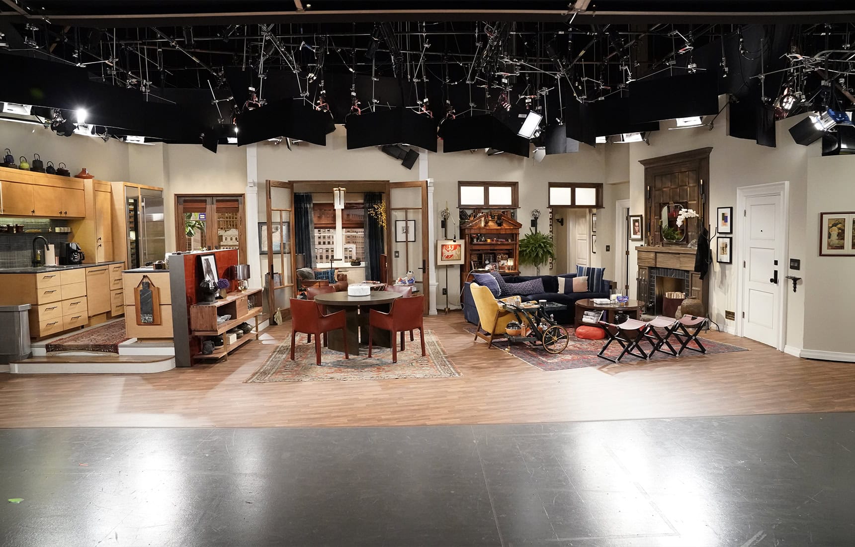
A sitcom set has to do one thing. It has to be legible from one side, instantly, to a camera and to several hundred people sitting in raked seating where the fourth wall would be.
That constraint is absolute, and it rewrites every convention in the discipline. Furniture is angled outward in ways nobody would arrange a real living room. Doors are positioned for entrances rather than for circulation. Surfaces are chosen for how they read under lighting rigs rather than for how they wear. And a quarter of the room is simply missing, permanently, while the remaining three quarters have to feel like a complete apartment.
The Will & Grace apartment is one of the most-watched examples of the form, seen across an original run from 1998 to 2006 and a revival that ran for three further seasons from 2017 to 2020. It was designed by Glenda Rovello, and the most interesting thing about it is her training.

Glenda Rovello trained under Robert Venturi and Charles Moore
Rovello is not a decorator who moved into television. She is an architect.
She took an architecture degree at the University of Texas at Austin, where the emphasis was on the big idea. She spent a year and a half at Barton Myers‘ Los Angeles office working on the Phoenix City Hall complex. She interned with Robert Venturi. She was a teaching assistant under Charles Moore. She then left conventional practice, was introduced to production design over a lunch at Paramount, and spent thirteen years working with a mentor before setting up on her own.
Read that list again, because it is remarkable.
Venturi and Moore are the two American architects most concerned with buildings as communication. Venturi’s argument, made across Complexity and Contradiction in Architecture and Learning from Las Vegas, was that architecture signals meaning to a viewer, and that the facade doing the signalling is a legitimate and serious subject. Moore built the Piazza d’Italia in New Orleans, an outdoor room in coloured stucco, neon and stainless steel that is unashamedly scenery, and is one of the most-discussed American spaces of its decade.
A multi-camera sitcom set is the purest possible version of what both of them were describing: a room whose entire job is to communicate to somebody looking at it.
Rovello’s own summary of her method is an architect’s sentence rather than a stylist’s. She works, she has said, from movement first, then style, then the layers of detail on top. First and foremost, it is about the plan.

No fourth wall changes every rule
Her term for these sets is precise: they are proscenium sets. There is no fourth wall, because it is open to the audience.
That single condition produces most of the design decisions.
The front of the set stays open, not only so the cameras and crew can work but so the audience can see and react. Comedy filmed before a live audience needs the laugh, and the laugh needs sightlines.

The room has to read as complete anyway. A missing wall is the most conspicuous absence a room can have, and the answer is to make the three remaining sides carry so much information that the eye stops asking. Full-height detail, a working kitchen, a hallway visible through a doorway, a fireplace with something above it.
And the fireplaces were adapted for the camera. The mirrors above them fold down, so that a camera can be placed where the chimney breast is and shoot back at the sofa for close-ups. It is a small piece of joinery and it is the whole discipline in one detail: a decorative element designed to be dismantled mid-scene because the shot needs the space it occupies.
Then everything is struck. Sets are deconstructed between seasons, so nothing is built to last and much of it is faux by necessity, chosen for how it photographs and how quickly it comes apart.

The hardest version of this brief
Will & Grace sets its designer a problem most sitcoms do not, and it is worth stating plainly.
One of the two residents is a professional interior designer. Grace Adler runs Grace Adler Designs, and a substantial amount of the show takes place in her studio.
That means the set cannot simply be legible and characterful. It has to survive being judged as decoration, because the fiction insists that a working decorator chose it. A set that reads as competent television design but implausible as the home of a professional would undercut the character every time she walked into it.

The studio was handled the same way. For the revival it expanded into the adjacent office, roughly doubling in size, gaining desks, a lounge area and a second entrance, with almost all the furniture replaced. The one thing that stayed was the central working table, the surface where the character’s designs are supposed to come together, kept in bold colour, heavy texture and contrasting pattern.
Leaving one object untouched while replacing everything around it is a character decision made in furniture. It says the practice has grown and the person has not changed.

The 2017 furniture is a biography
When the show returned in 2017 the characters were older and more successful, and the specification went up to match. This is set decoration used as biography, and the pieces are named.
A Holly Hunt sofa. A Rose Tarlow coffee table. Four Cassina Cab chairs at the dining table, the leather-over-steel design Mario Bellini drew for Cassina in 1977 and one of the most quietly recognisable chairs of the period. And an Hermès Pippa bench.
The kitchen gained a SubZero refrigerator and a taller wine fridge, which is the kind of upgrade that says more about a character’s income than a line of dialogue could.
The hallway changed most. Light wallpaper gave way to deep blue paint, contemporary artwork came in from New York galleries, a new decorative floor pattern went down, and the door numerals were reset in a modern dark metal. Where a coffee shop had been, an upholstered bench appeared. And the service lift doors were replaced with salvaged metal and glass doors sourced upstate and professionally restored.
That last detail is the giveaway. Salvaging and restoring period lift doors for a set that will be dismantled is not an economy. It is somebody choosing the real thing because the camera can tell.

The Pippa bench is a joke only an architect would make
Of everything on that list, the Hermès piece is the one worth stopping on, because of what it is.
Pippa was designed for Hermès in the mid-1980s by Rena Dumas with Peter Coles. Dumas was a Greek-born architect, trained in France, Greece and the United States, who founded her Paris practice in 1972 and went on to design Hermès stores around the world. The collection runs to ten pieces in pearwood, leather and polished brass, and its entire premise is portability. The desk folds to the depth of a briefcase.
It is furniture designed by an architect to be taken apart and carried.
Which places, on a set that is itself struck and rebuilt between seasons, a piece of furniture whose defining characteristic is that it comes apart and travels. Both designed by architects. Both built to the highest possible standard for something not intended to stay put.
Whether that was deliberate hardly matters. It is the neatest available summary of what set design actually is: permanent-quality work, made to be demountable, by people who know exactly how buildings are put together.

The last thing she built was somebody else’s set
The revival ended on 24 April 2020 with an episode called We Love Lucy, and it gave Rovello the strangest brief of the run: rebuild four sets from I Love Lucy inside the sets of Will & Grace.
She and her team recreated the Ricardos’ apartment, the candy factory from the famous conveyor belt episode, an Italian restaurant, and the Vitameatavegamin commercial set. The research method was to watch the originals repeatedly on YouTube, which Rovello has described, with some feeling, as the hardest part of the job.
Two details from that build are worth having.
The doors nearly stopped them. The original art director had specified unusually tall, non-standard doors, and nothing on the market matched. The eventually correct pieces were tracked down in a prop house, having been made years earlier for Mambo Kings.
And the colour is the clever part. The episode was shot before the network had confirmed whether it would air in black and white, so Rovello built everything to work either way. Earth tones for the Italian restaurant, taupe for the candy factory, pink undertones for the apartment: a palette calibrated so the sets would read as distinct greys in monochrome and as three separate rooms in colour.
That is a piece of technical reasoning no domestic interior ever has to make, and it is a neat illustration of the difference. An interior designer chooses colour for how it will look. A production designer chooses colour for how it will be reproduced.
The candy, incidentally, came from See’s, made to the same recipe used on the original in the 1950s.

Frequently asked questions
Who designed the Will & Grace set?
Glenda Rovello, the production designer, who holds an architecture degree from the University of Texas at Austin.
What is her architectural background?
She worked at Barton Myers in Los Angeles on the Phoenix City Hall complex, interned with Robert Venturi and was a teaching assistant under Charles Moore.
What is a proscenium set?
A set with no fourth wall, left open to the cameras, the crew and the live studio audience. Multi-camera sitcoms are filmed this way.
Why do the fireplace mirrors fold down?
So a camera can be positioned in the chimney breast and shoot back towards the sofa for close-ups.
What furniture is in the apartment?
The revival included a Holly Hunt sofa, a Rose Tarlow coffee table, four Cassina Cab chairs by Mario Bellini and an Hermès Pippa bench, with a SubZero refrigerator in the kitchen.
What is the Hermès Pippa collection?
A folding furniture collection designed for Hermès in the mid-1980s by the architect Rena Dumas with Peter Coles, in pearwood, leather and polished brass.
What changed in the hallway for the revival?
Deep blue paint replaced light wallpaper, new artwork came from New York galleries, a decorative floor pattern was laid, the door numerals were reset in dark metal, and the service lift doors were replaced with salvaged metal and glass doors restored from upstate New York.
When did the show run?
From 1998 to 2006, then for three further seasons from 2017 to 2020.
Who photographed the sets?
Chris Haston for NBC.

Final thoughts
There is a habit of treating set design as decoration with a deadline. It is closer to the opposite.
A set is a plan problem before it is anything else. It has to work for the actors’ movement, the camera’s position, the crew’s access and the audience’s sightlines, all at once, with one wall permanently absent. Only when all of that resolves does anybody choose a sofa. Movement first, then style, then the layers of detail.
That is why an architect who spent time with Venturi and Charles Moore ended up drawing one of the most familiar apartments on American television. Both of those architects spent their careers arguing that a building communicates, and that the communicating is real work rather than a decorative afterthought.
A sitcom apartment communicates or it fails. There is no second visit, no walking through, no living with it. There is one angle, a few seconds, and a room that has to tell you immediately who lives there and how they are doing.


Leave a Reply